
Behind the brand.
The name
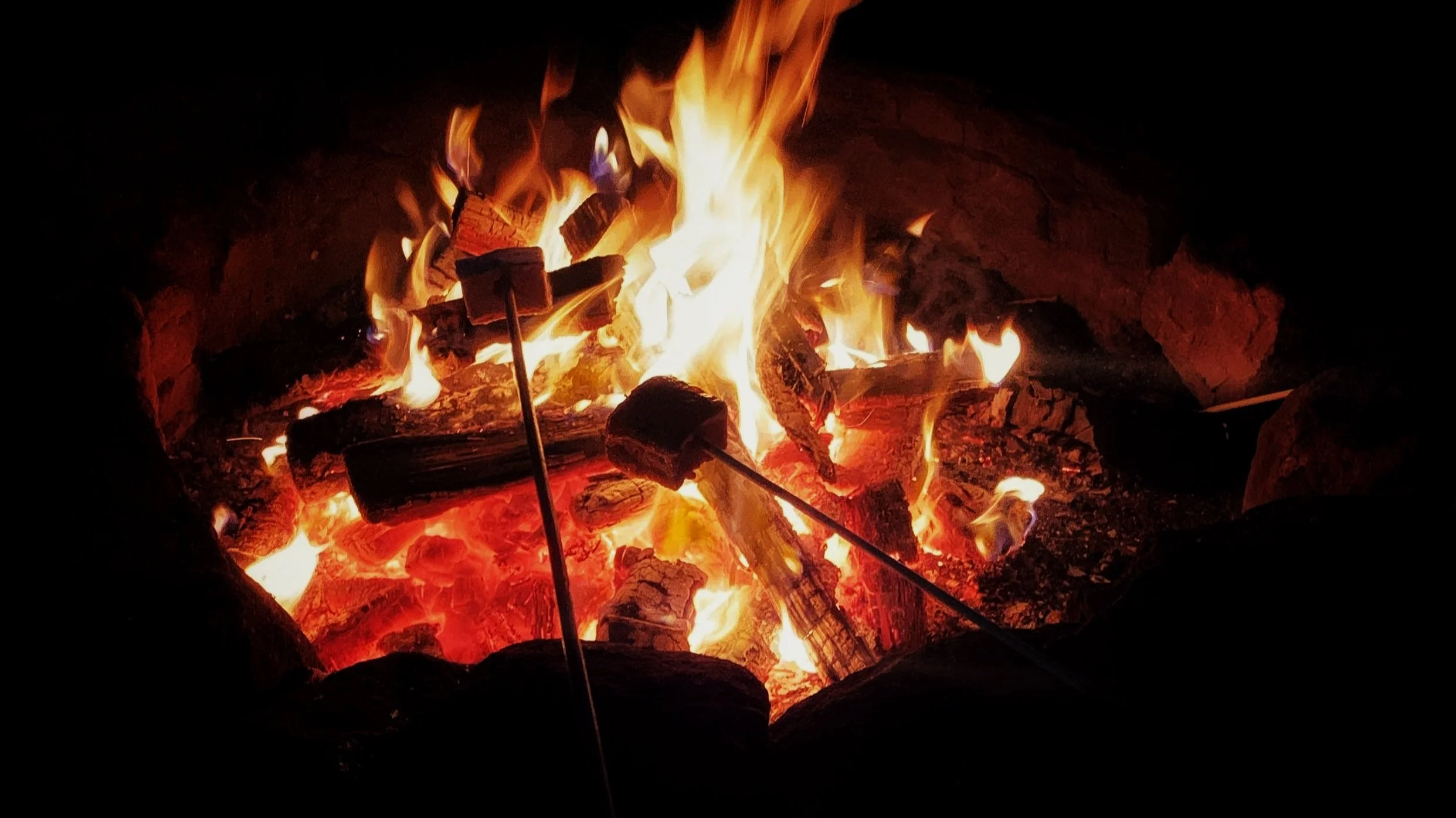
As Canadians, most have spent many nights around the campfire and no campfire is complete without The Tragically Hip on the playlist. Gord Downie wrote about the vast plains at the 100th meridian along with a catalogue of songs about his love and admiration for the amazing country we live in. We feel the same sentiment about our country and the little island at the 63rd meridian that we call home. So that’s the simple story behind the inspiration for the name, Meridian63°.
The logo
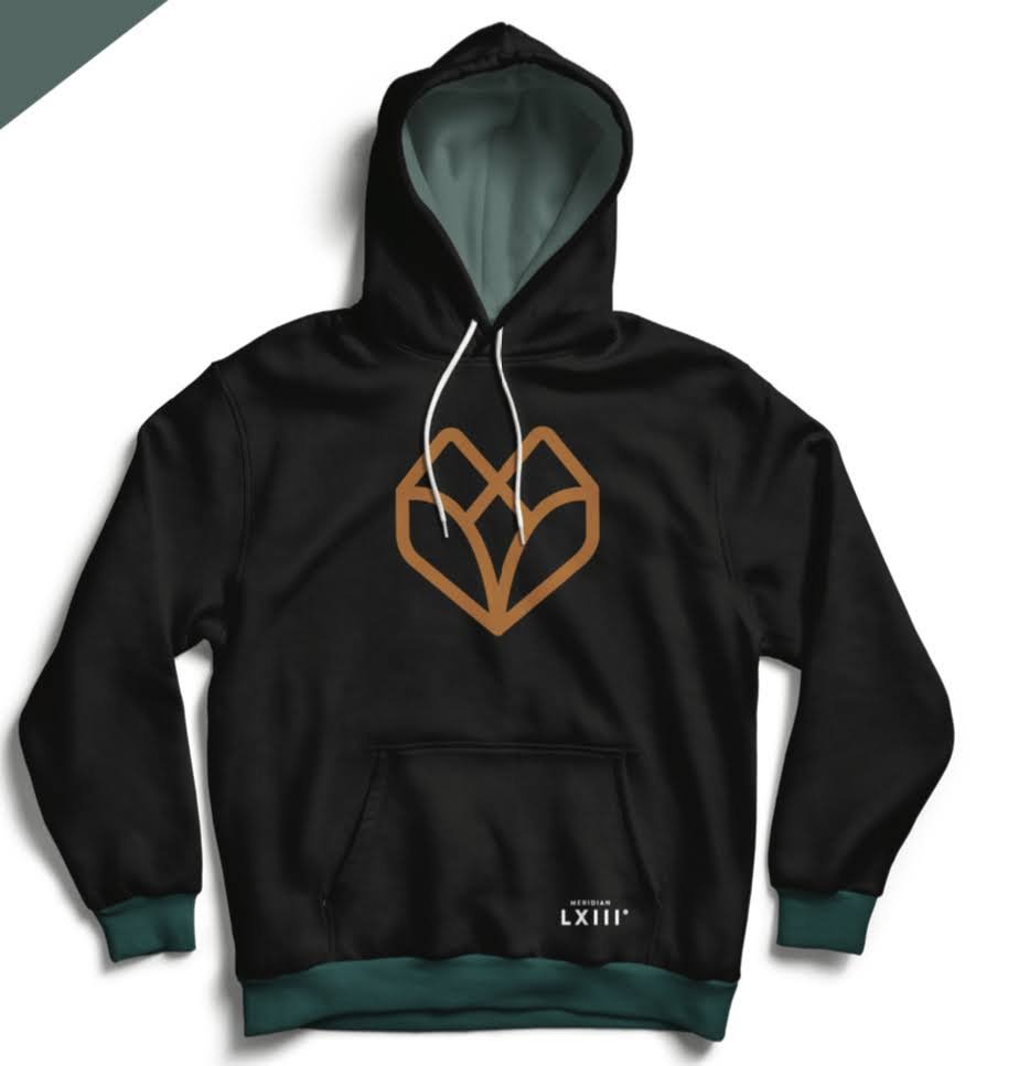
Our buds at Dose Media love travel and the outdoors just as much as we do. Most of all, they understand our vision for the company and have a long list of kick ass branding projects in their portfolio. We knew they were the right choice and after a few weeks of branding exercises and meetings to get to the core of the brand. The logos were designed, narrowed down and it was time to pick. While it wasn’t an easy decision, the fox head you see above stood out above the rest and just felt right.
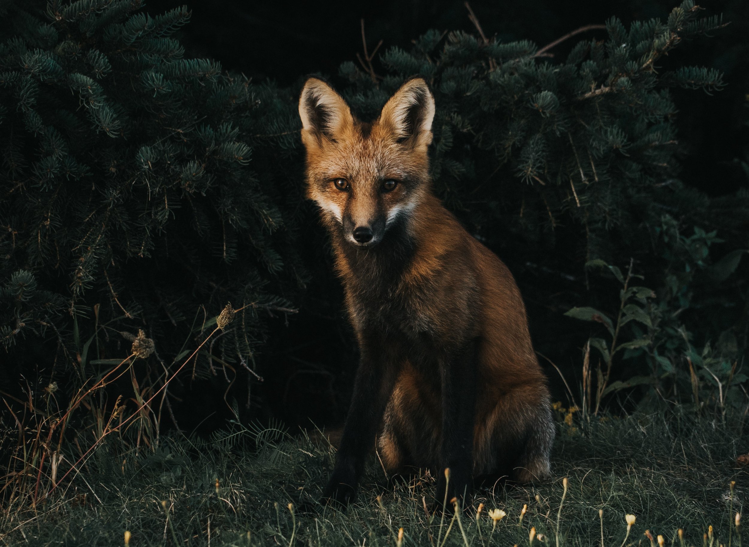
The fox, Prince Edward Island’s provincial animal represents fire and sun and symbolizes independence and playfulness.
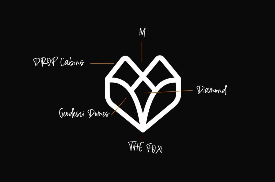
While the logo may simply just look like a fox, subtle elements including the M for Meridian, the shape of cabins and geodesic domes and the diamond in the middle tie it all together. It’s simple, elegant and it looks awesome on a hoodie!
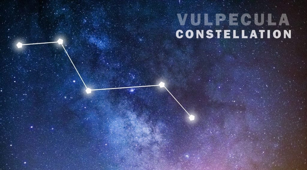
Another interesting fact revealed through the branding process was that the Vulpecula constellation in the northern sky is referred to as “Little Fox” and forms the shape of an M. You’ll see elements of starry nights through our branding and soon, you’ll get to see the Vulpecula constellation while sitting around a campfire in the park.
The experience
We believe that you don’t need large rooms and all the modern amenities to enjoy travel. Take the time to slow down, relax and enjoy being outdoors. There are so many adventures waiting for you on our island and we look forward to making that easier for you to experience.
While the days are filled with adventure, the evenings are for relaxing and gazing at the stars. While staying with us, we want you to be comfortable, content and while tired from the day’s adventures, filled with excitement for tomorrow.
Life is better when you are roughing it luxuriously at the 63rd meridian.
More news on Phase 1 of coming soon! If you want to join the waitlist, sign up here or follow along on social media.